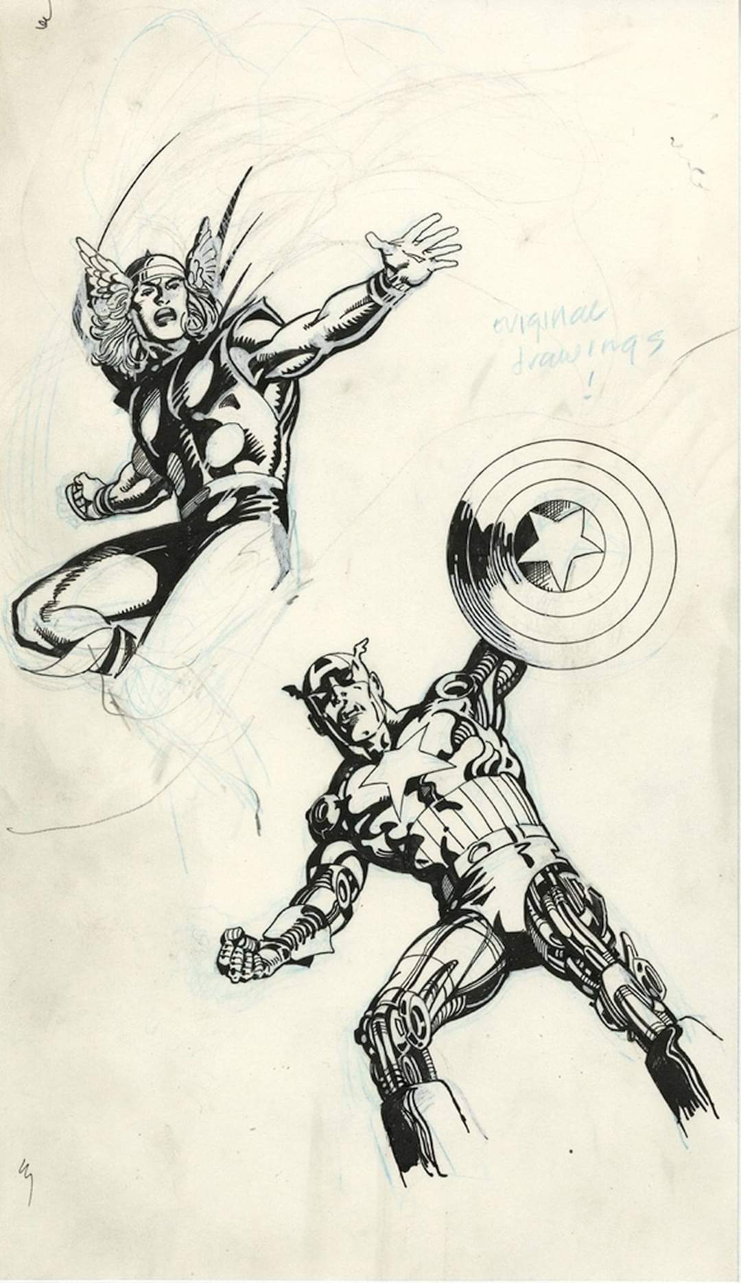
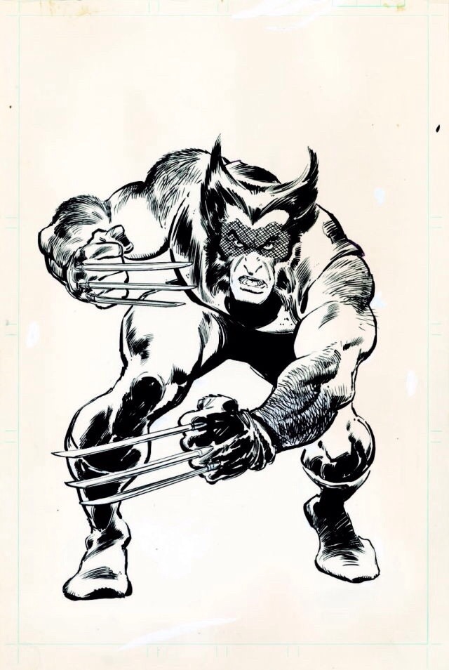
Ron Frenz & Tom Palmer
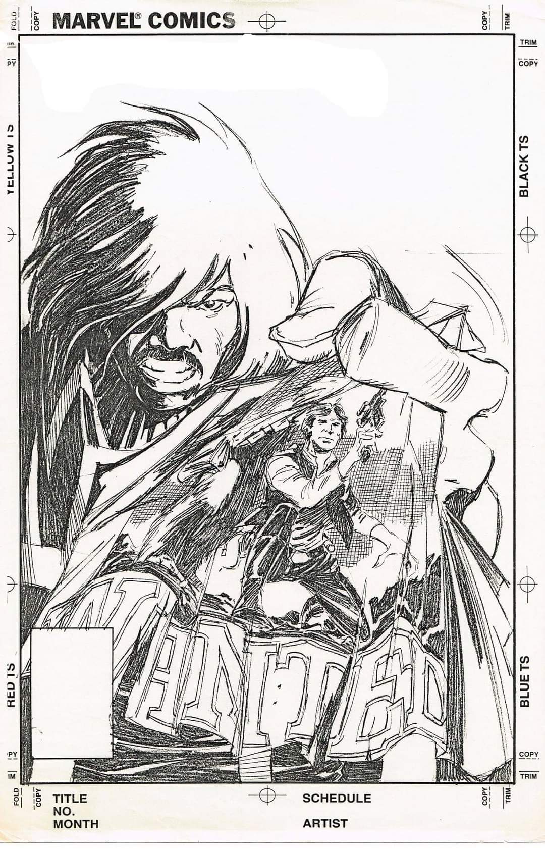
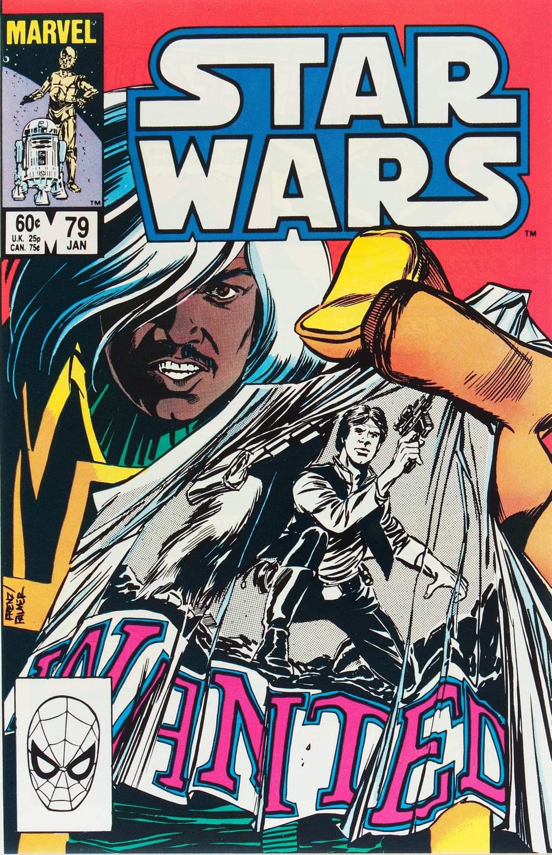
Ron Frenz & Tom Palmer
Perfectionniste ce Davis.
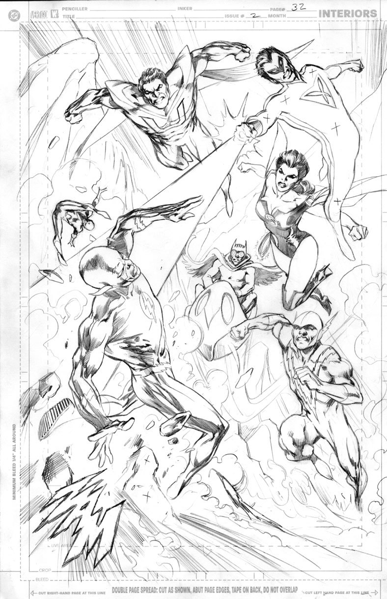
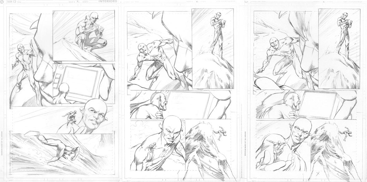
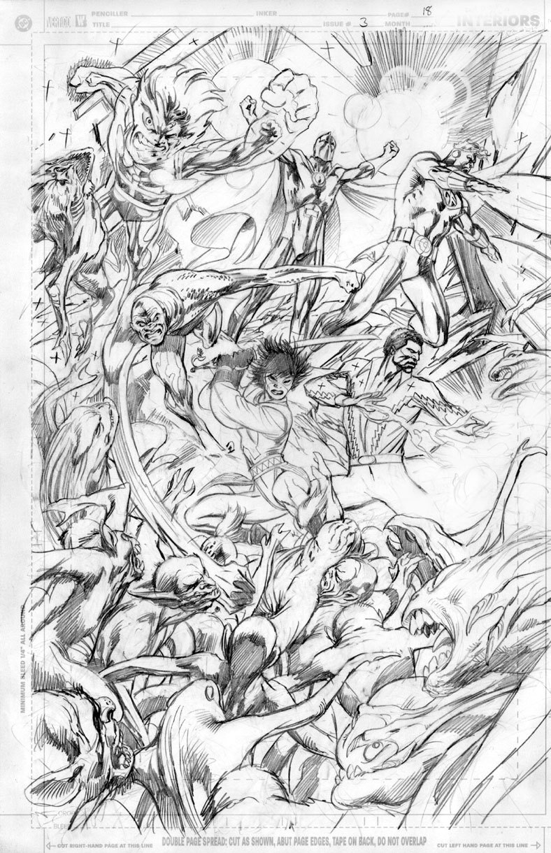
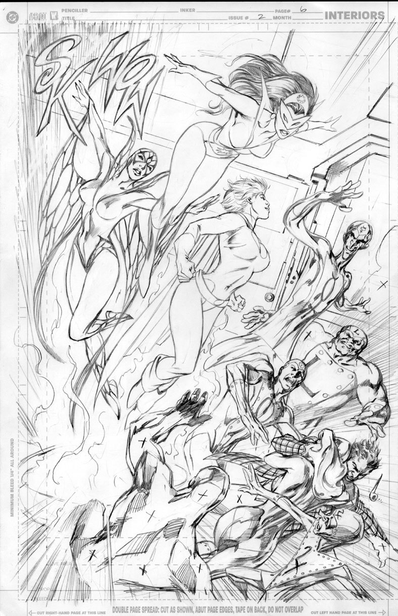
This is a ‘spare’ version of Justice League: The Nail #2, drawn by Alan Davis, but discarded because it wasn’t good enough. Obviously…
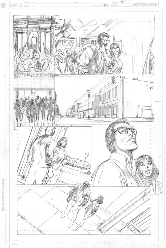
This is an unused version of page 37 from issue 2 of Another Nail #2, drawn by Alan Davis, and discarded because he didn’t think it was good enough.
Another instance of an alternate page of art from Justice League: Another Nail , drawn by Alan Davis. This time, the change was to make the THUNDER Agents in panel four unidentifiable because their book which was in the pipeline fell through.
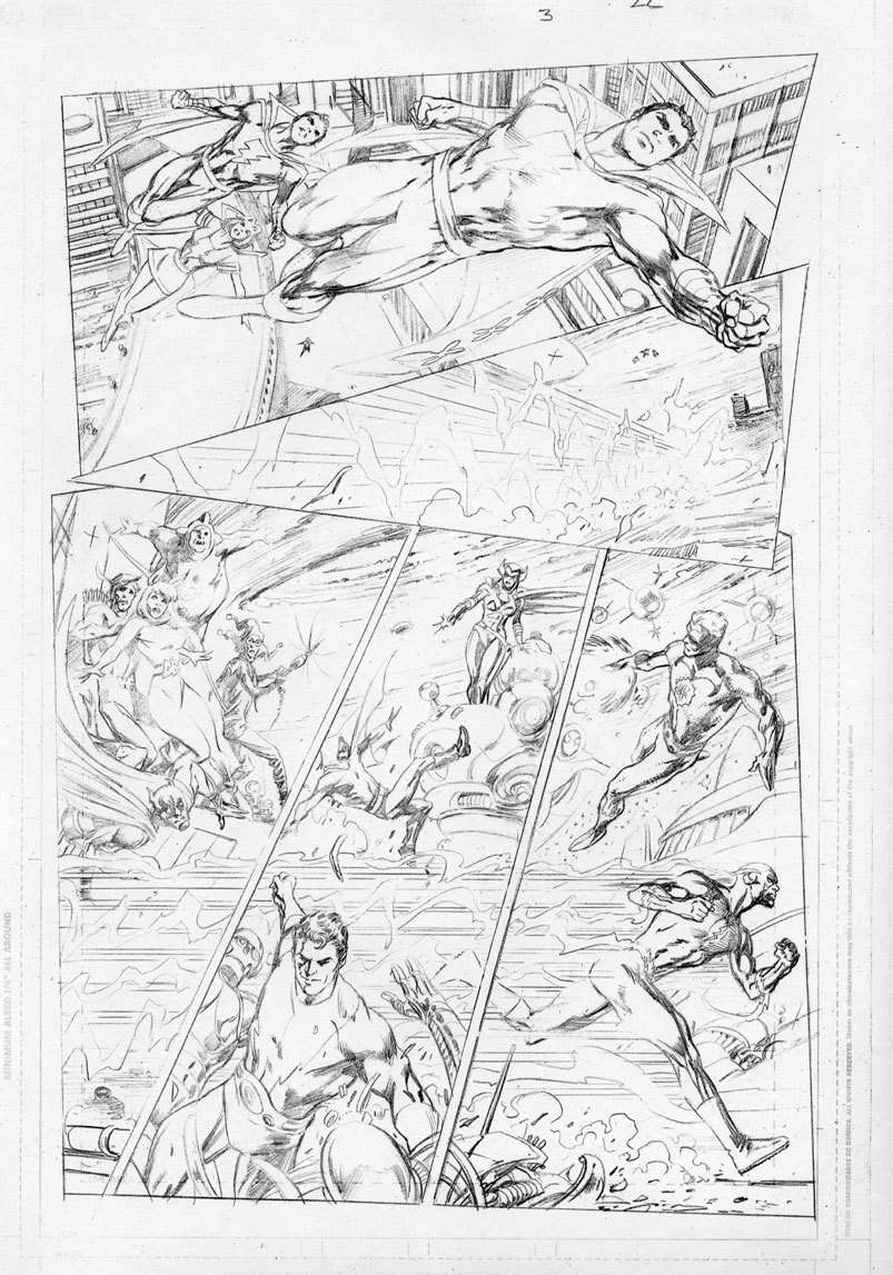
More discarded art from Justice League: Another Nail , drawn by Alan Davis. This one shows two versions before the final page on the right, with which Alan was finally happy.
Another piece of discarded art from Justice League: Another Nail , drawn by Alan Davis, whose high standards meant that this wasn’t good enough for publication.
More discarded art from Justice League: Another Nail , drawn by Alan Davis, who thought it wasn’t up to his high standards.
The last page Jack Kirby drew for DC Comics.
Je ne sais pas trop où déposer ceci… Mais j’ai trouvé ça intéressant…
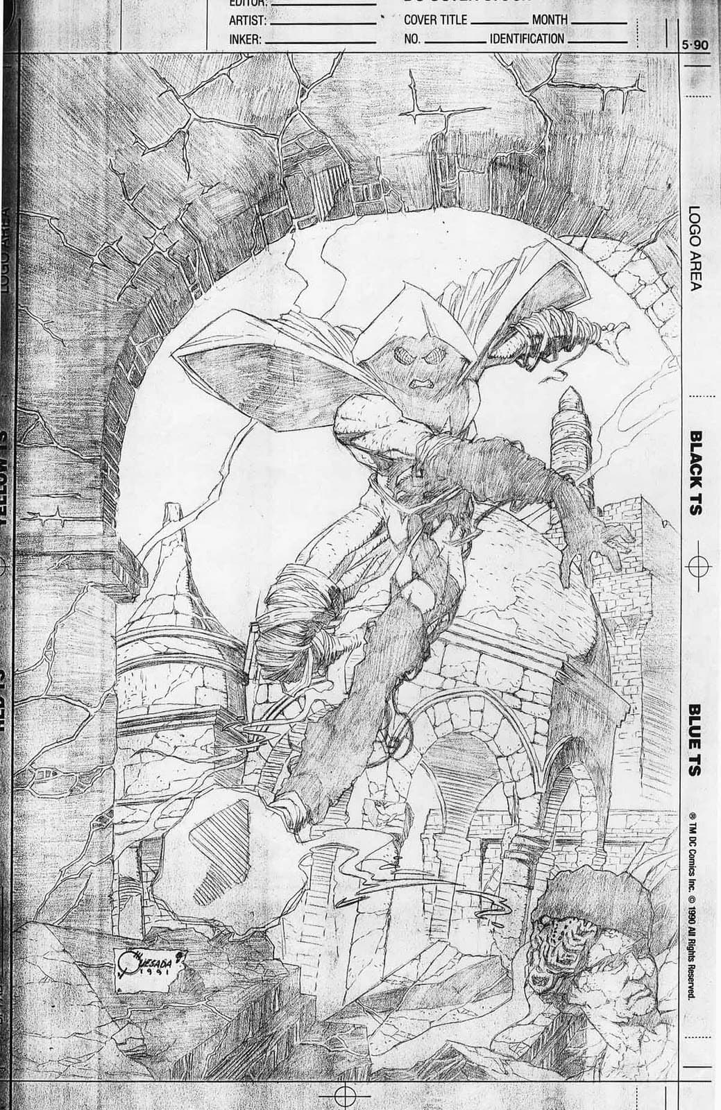
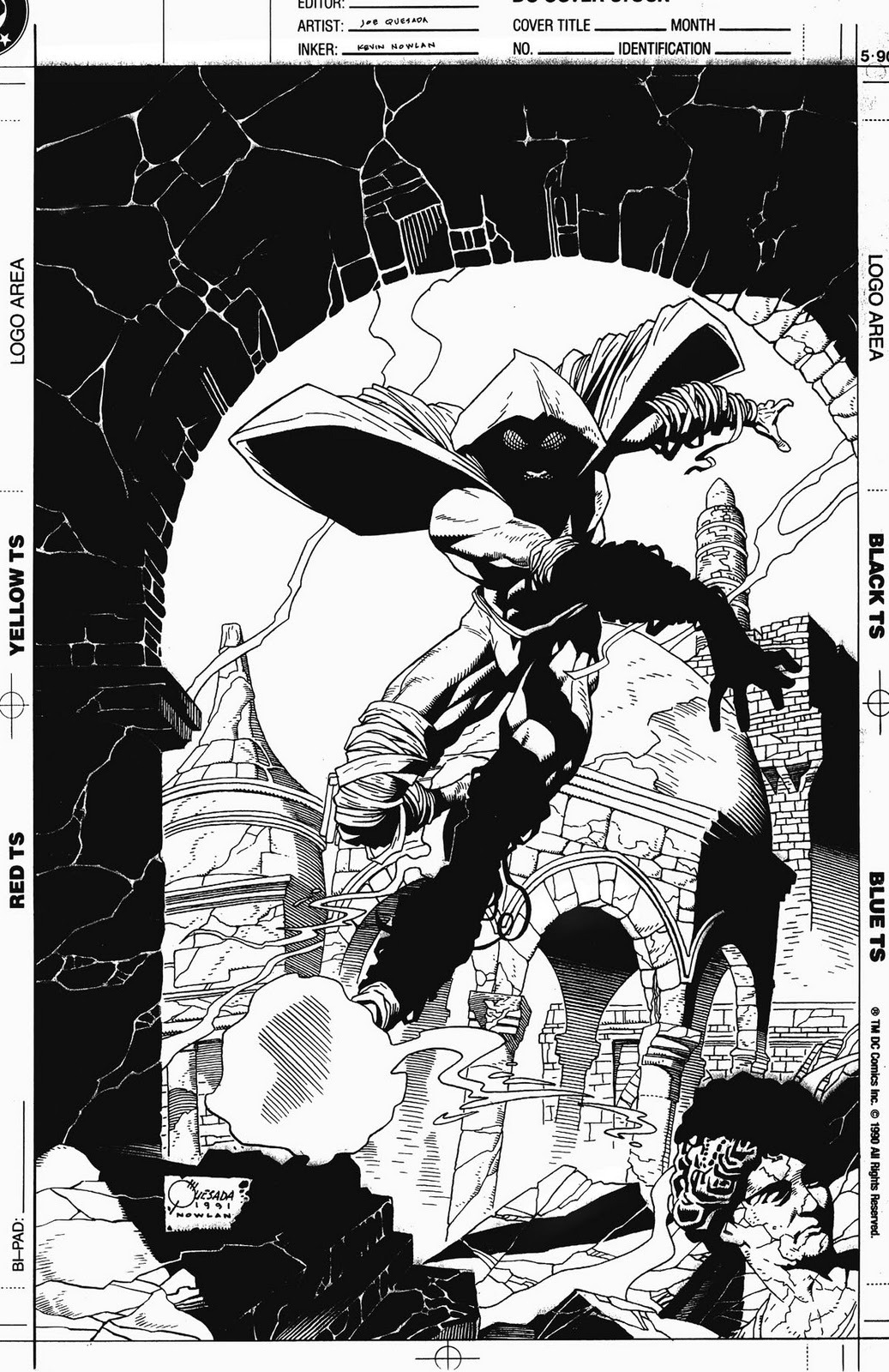
Quesada/Nowlan :
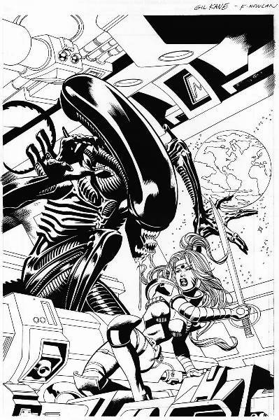
Gil Kane/Kevin Nowlan :
"About 10 years ago WildStorm and Dark Horse Comics agreed to do a WildC.A.T.s/Aliens X-Over, it was to be the first of several such events featuring various properties (the others never happened, can’t remember why). One of my goals was that this should be a book with lasting effects, unlike the usual cross-company epics that come and go and mean nothing. Since Warren Ellis was wrapping up his run on Stormwatch, before diving into The Authority, I thought it would be an interesting idea to kill off a large portion of the remaining Stormwatch characters, the ones that wouldn’t be moving on to the new book (For those unfamiliar with either series, The Authority sprang from Stormwatch, or what was left of it).
Chris Sprouse and Kevin Nowlan handled the art duties on the book, and they did a splendid job. But it’s not generally known that before Chris was attached, the story was to be penciled by comic’s veteran Gil Kane, who unfortunately had to bow out at the last minute for health reasons.
Kane was a real character, there are a million stories about him floating around, and this one is mine. I had long been a fan of Kane’s work, especially the groundbreaking HIS NAME IS SAVAGE and BLACKMARK. In his long career he drew practically every major character at DC and Marvel. When I asked Gil if he’d be interested in penciling our X-Over he readily agreed, and was especially pleased when I told him I wanted Kevin to ink it, having enjoyed their previous collaborations together.
This goes back to the pre DC days when we were just WildStorm, quite a bit smaller. Things happen at a much more frenzied pace at a small company, such was the case with this book. Thinking the title had potential to be a good seller, John Nee, formerly President of WildStorm and now Senior VP at DC, decided to spring for an ad in Wizard magazine, not an inexpensive proposition. The catch was that the final color file was due in five days and we didn’t have any art yet, not even a sketch. So I called Gil and told him the situation, and that we needed a piece of art fast for the ad.
My idea was to have the image feature two characters, Zealot from the WildC.A.T.s and, from the Dark Horse side, an Alien. It would be dramatic and, more importantly, save time–a full team shot would take longer to draw. I told him I wanted the two characters prominently displayed; on one side would be the Alien, looming large behind Zealot, who has her sword drawn up. I asked Gil to make her expression defiant, not fearful. To establish the location, on the Stormwatch satellite, I asked that he put a porthole somewhere with the Earth visible through it. I had already sent Gil all the reference for the WildC.A.T.s and Stormwatch characters and he said he didn’t need any for the Aliens. He told me he could turn the piece around by the next day and, since time was a major issue, would Fed-ex it directly to Kevin and fax it to me. In the end Gil didn’t send the fax, that old Fed-Ex deadline was too tight for him to make a copy.
The next day I called Kevin to ask him if the piece had arrived. He said it did and that it was beautiful…but he told me I should take a look at it. I hurried to the front reception area and his fax was waiting for me. Just as Kevin said, it was beautiful. Gil, pro that he was, had kept exactly to the layout we discussed; there was Zealot, defiant and slightly turning, a window with the earth visible, and a beautiful Alien towering over her. The only real drawback was that Gil apparently had never heard of the Aliens franchise."
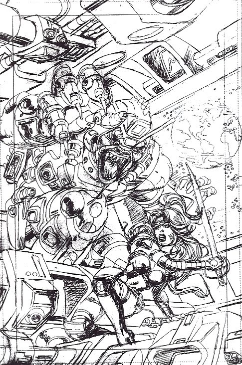
"I called up Kevin in a panic and said “What are we gonna do?” to which my old pal replied “Whattaya mean WE, white man?” I told him we had a serious deadline, that I needed him to fix the alien so we could get it to Wizard for our ad. Kevin responded with a groan saying he didn’t want to, that it was too much work. I then said the magic words “I’ll pay you double rate” to which he cheerfully told me he would be happy to oblige.
In the end we made the Wizard deadline by the skin of our teeth, and I got to work with a true legend in comics. It may not have been the whole book but at least I can say Gil Kane did a cover for me. Or, anyway, half of one."

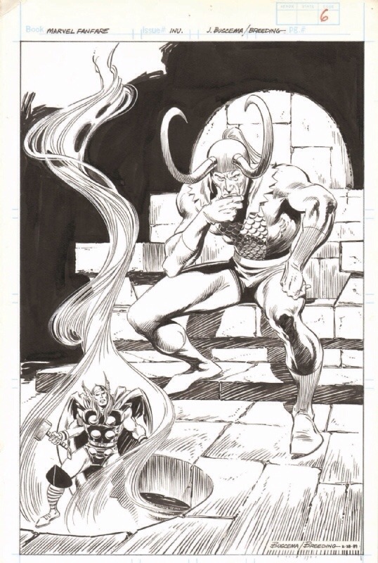
Marvel Fanfare, Vol. 1 # 45 Page 06 was penciled by Big John Buscema, inked by Brett Breeding, and colored by Bret Blevins.
Oups
Dans le même genre :
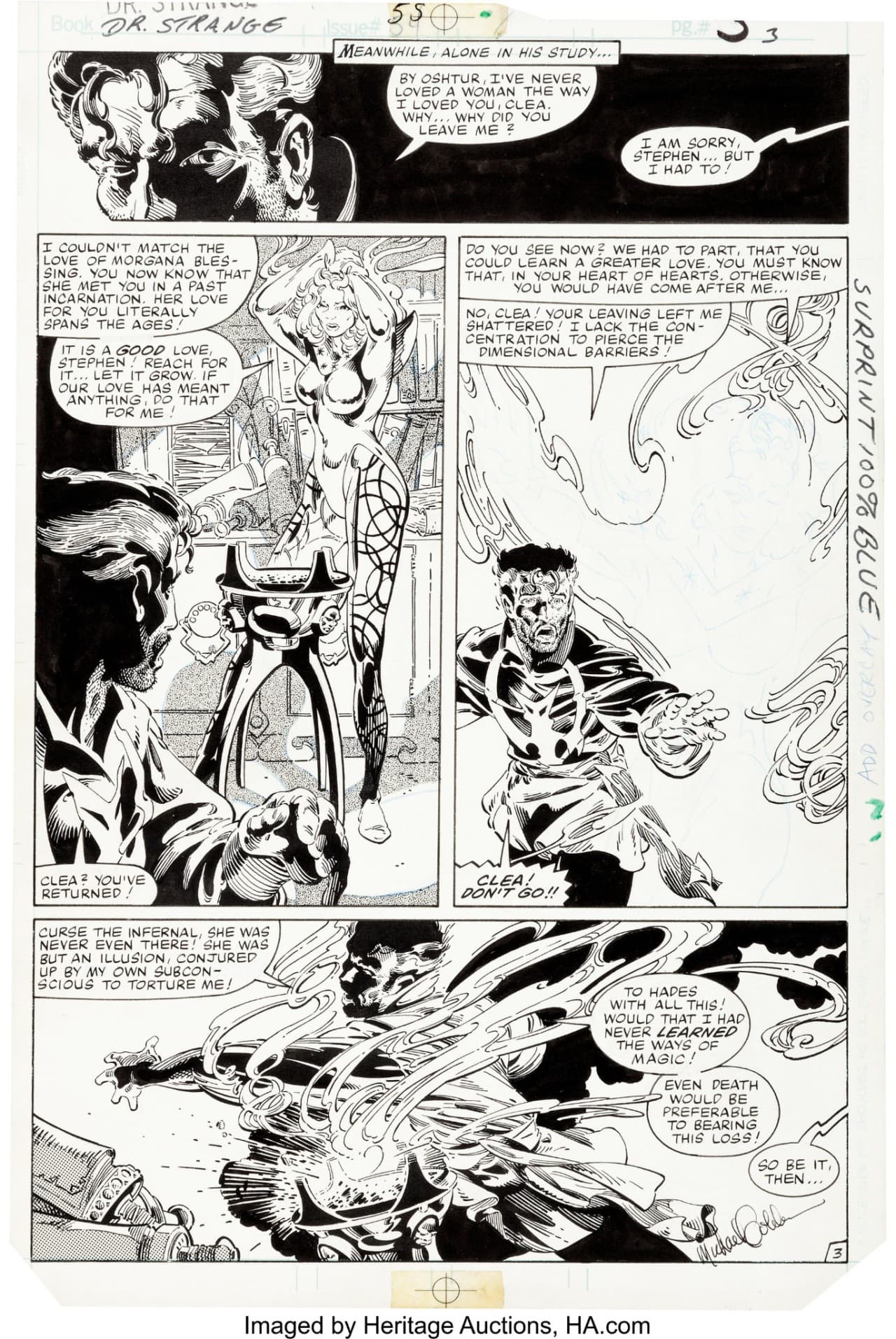
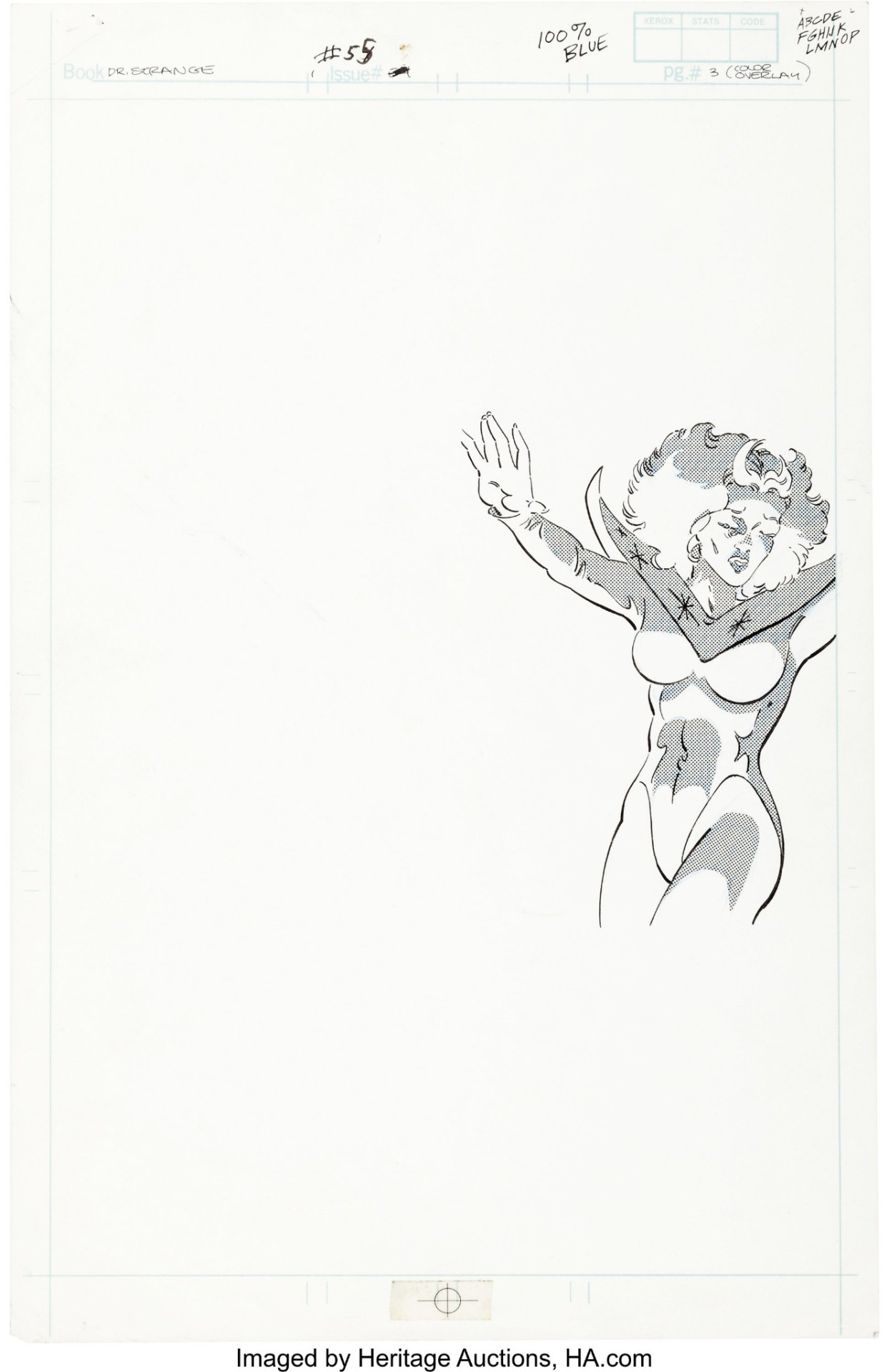
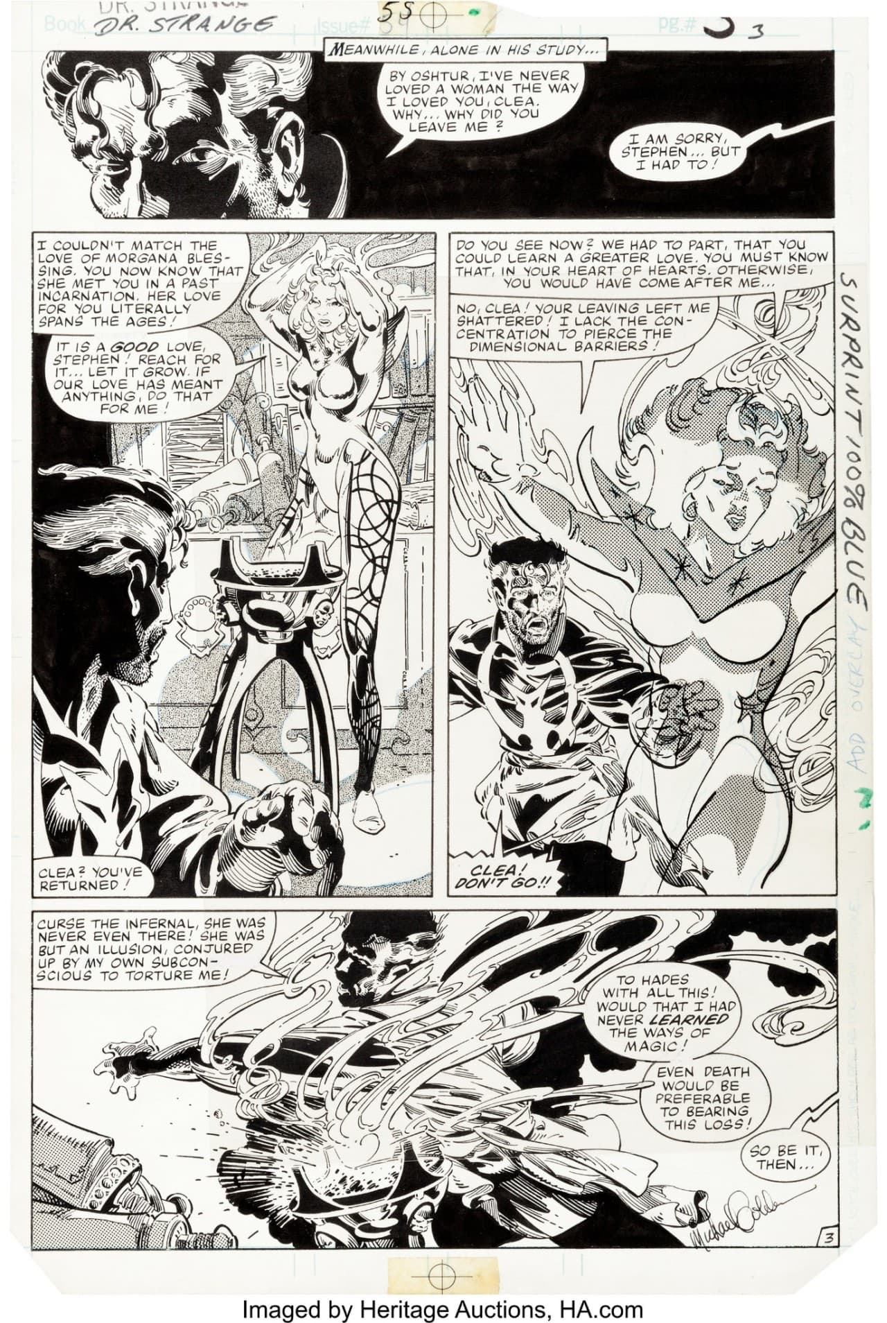
Original Art - Doctor Strange #055 Pg 03 (1982) by Michael Golden And Terry Austin
From ha.com…
The figure of Clea in Panel 3 was a color hold effect. The original art for the figure is included, and it was created in exactly the same way on a separate sheet of Bristol board. It was then shot and turned into an acetate overlay,
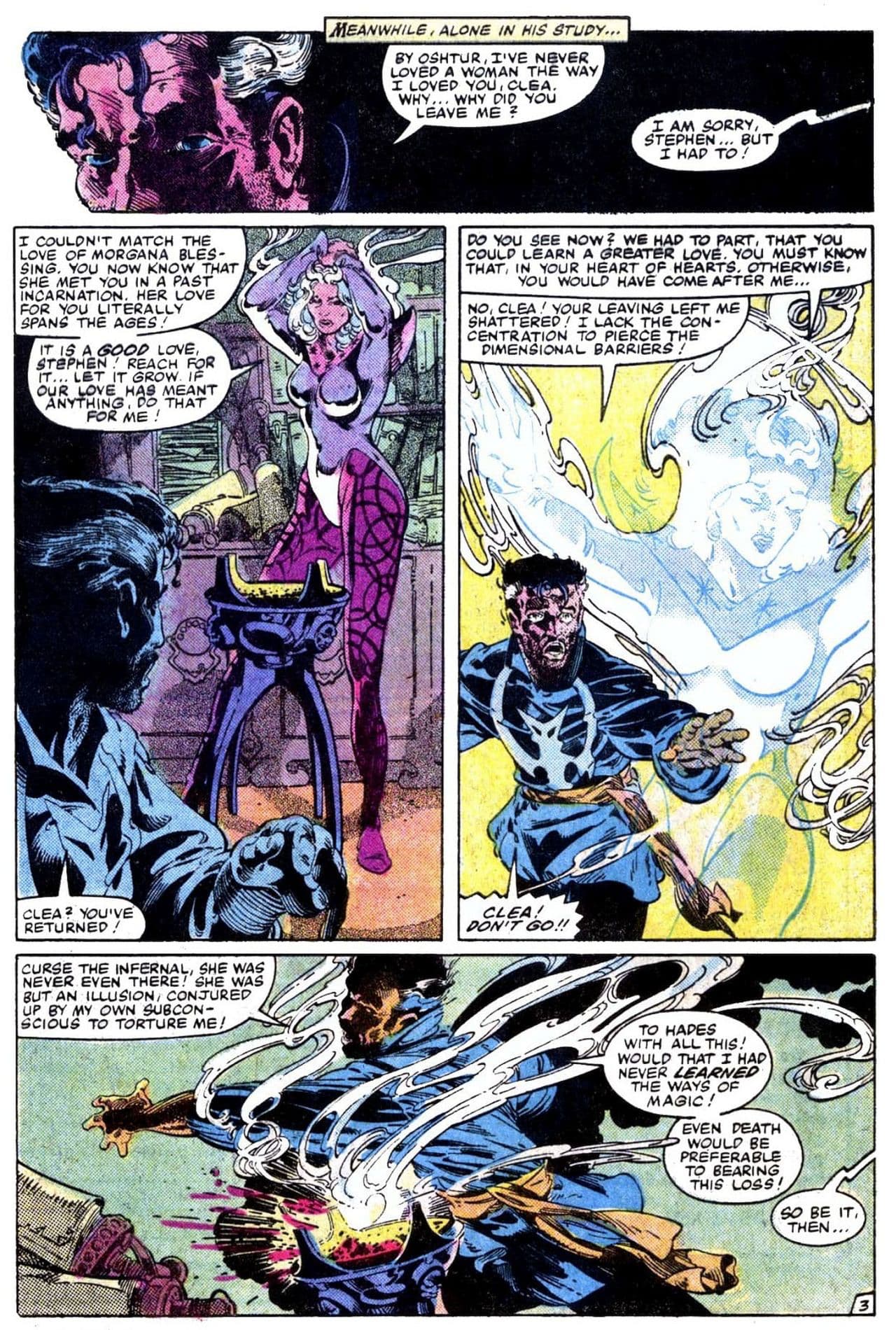
…and here is how it looked when it was published:
Letters by Jim Novak, Colors by Glynis Wein, and a Script by Roger Stern.
Vraiment, je trouve ça magnifique. Presque plus beau que certains effets modernes. Plus évocateur.
Jim
Plus organique aussi.
Oui, y a un côté « bout de ficelle » que j’aime beaucoup. C’est moins nickel. C’est comme les effets spéciaux modernes : j’aime encore les masques en latex de Doctor Who, moi.
Jim
Y a des effets modernes qui sont moins bien foutus et qui vieillissent mal. Au ciné comme en BD.
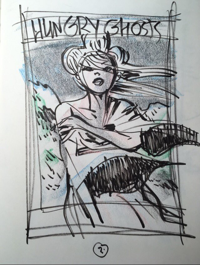
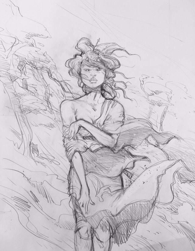
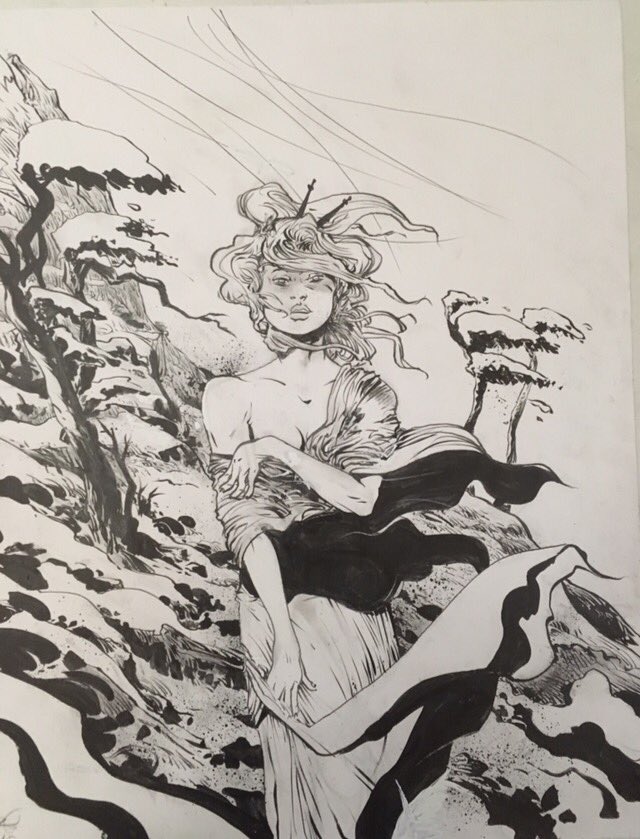
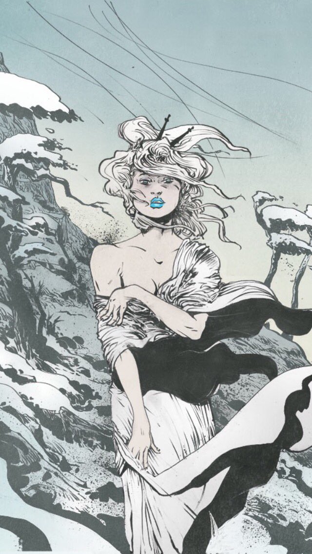
Paul Pope
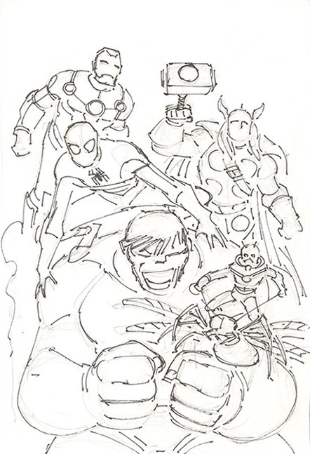
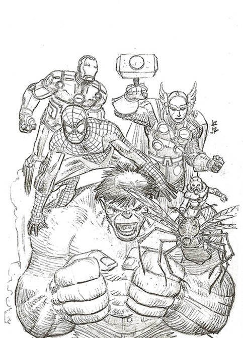
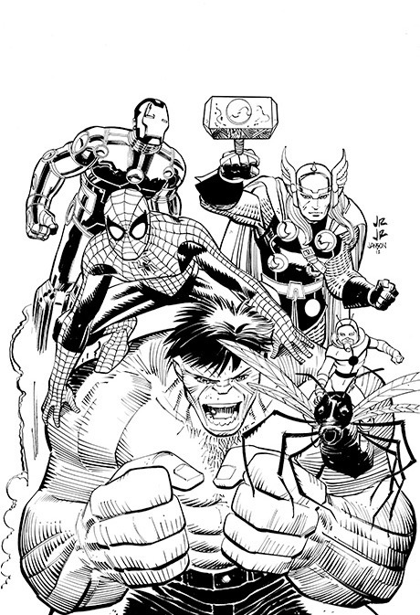
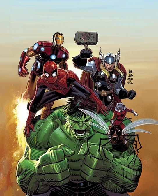
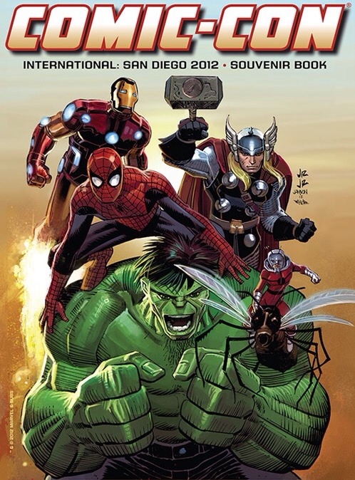
the 2012 SDCC Souvenir Book Cover artwork was illustrated in pencil by John Romita, Jr., with inks by Klaus Janson, and colors by Dean White.
2012 was the 50th Anniversary for all 5 of the Marvelous Characters that Johnny so perfectly depicted, making this even more awesome!
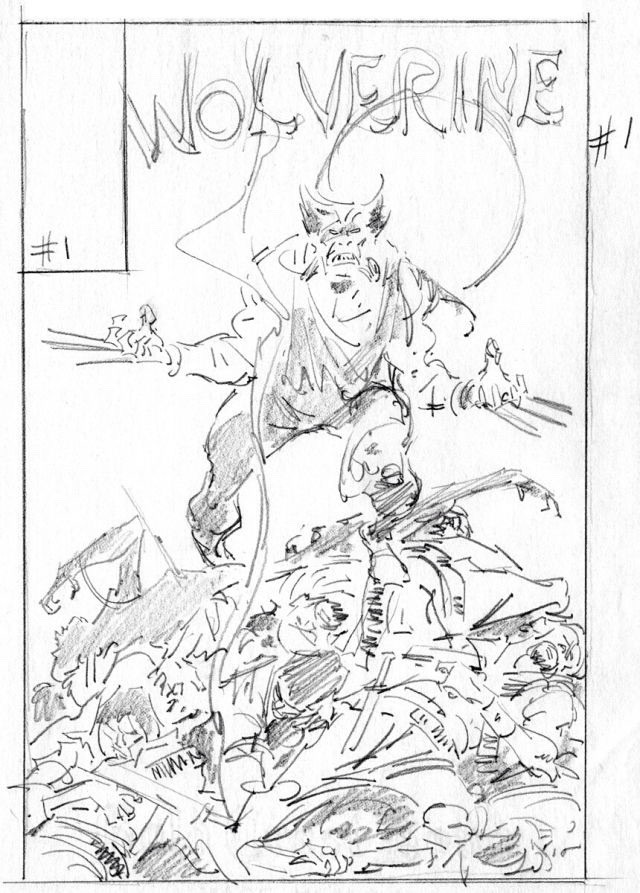
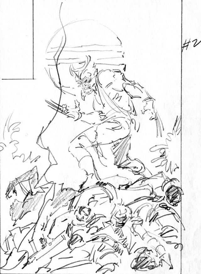
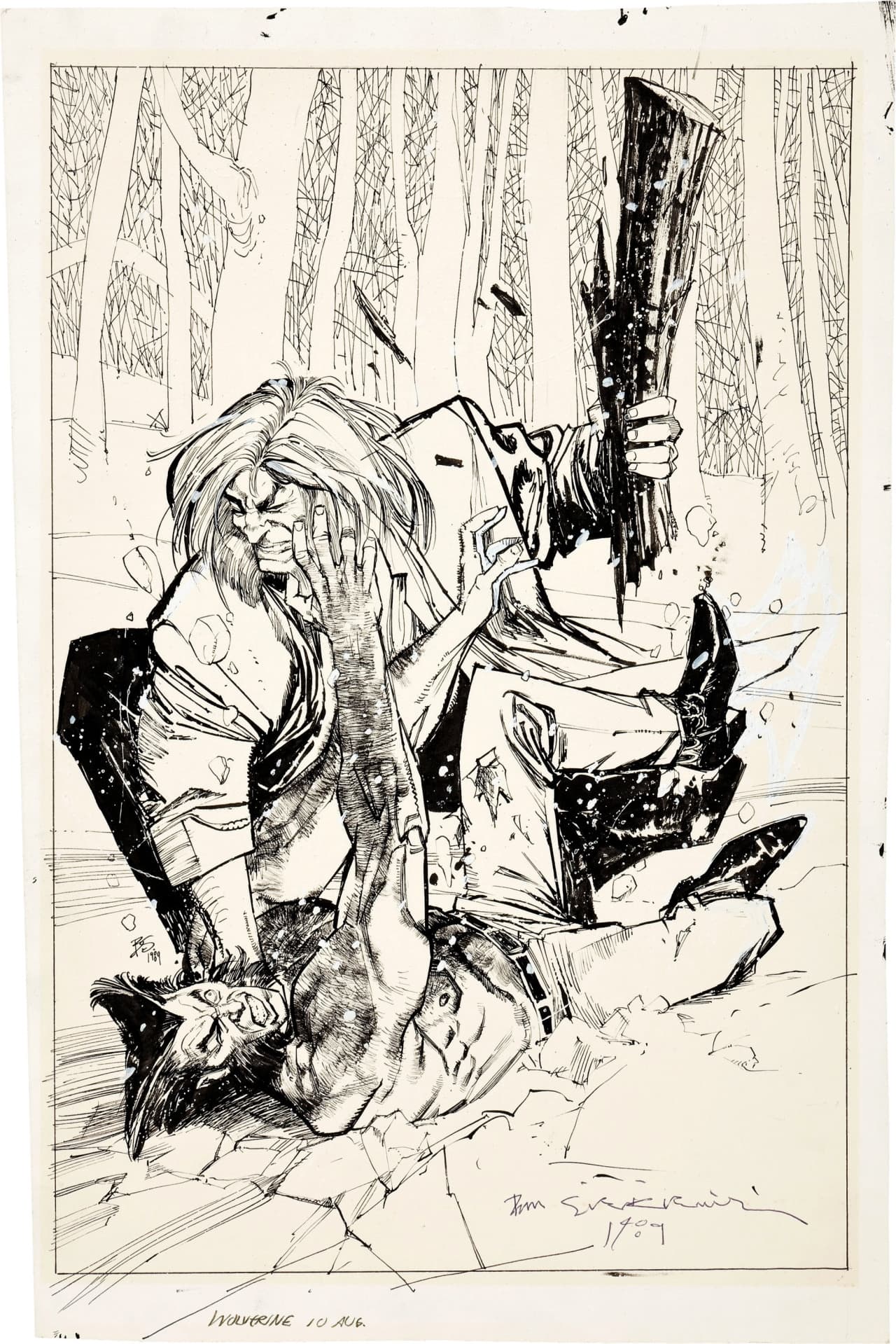
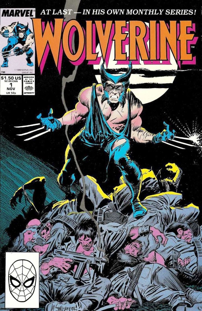
Wolverine, Vol. 2 # 01, by John Buscema. the Indica pinup art was inked by Klaus Janson. Big John inked his own work for the cover, and Al Williamson inked the interior artwork. I think that either Christie Scheele or George Roussos did the colors.
Ah génial ton dernier message, Marko. Merci.
Buscema/Sienkiewicz :
La classe.
L’académisme allié à l’hystérie.
Jim
